Scroll First, Click Second: How Web Design is Evolving
 Web design has come a long way. Many of us remember the days of dancing baby GIFs, “under construction” signs, and flash-driven, cluttered web pages. Some far more recent trends, however, are going the way of the dodo with the advent of responsive design and the emphasis on mobile. From landing pages stuffed with as much content as they can fit, to slideshows that require clicking tiny numbers at the bottom of the page, a lot of the more recent design elements you’ve become accustomed to will likely disappear in the next year or so. And the change has already started. Here are some of the biggest ways that web design is currently evolving:
Scrolling is becoming more important than clicking
Let’s face it: scrolling used to be harder. At the time, it made sense to have a lot of links and buttons to redirect people so that they wouldn’t have to use a scroll bar as often. However, the rise of mobile has made it necessary to come up with a faster, more intuitive option. Now, site visitors can scroll down to the information they want with a swipe of the finger. This gives web designers more freedom as they now don’t have to focus on cramming as much important information onto the main landing page as possible and can work based on aesthetics and user friendliness.
Clicking buttons are getting bigger and less frequent
One of the disadvantages of using a mobile device is that clicking tiny links and buttons can be difficult – which means that newer designs are taking this into account and creating larger, easy-to-click buttons and links. Web designers are also trying to decrease the need for such links by making longer scrolling pages that require less to and from.
Ghost Buttons
Of course, bigger buttons can sometimes take up more space than designers might want. One of the new ways to get around this is the use of ghost buttons. These are transparent buttons on which the only visible elements are the outline and a directive, such as “click here” or “find out more”. Through it, you can still see the background on the site, creating a more continuous, seamless appearance.
Pictures are larger, more frequent, and have more emphasis
Depending on the type of site web designers are operating and the intended purpose of it, some people are opting out of photos altogether. Those that are holding onto photos, however, are using more pictures and making them larger, often having them fill the whole screen. Generally, these pictures will be realistic that show people using products or interacting in a believable way. Boring stock photos with white backdrops are out!
Unique (but easy to read) typography
Simple, large, and easy-to-read typography is key. No one wants to have to squint at tiny writing with narrow line spacing or try to interpret the fancy cursive font that most of America is no longer taught how to read or write. Many savvy designers are choosing slightly quirky, unassuming typefaces to convey information without distraction.
Flat design has taken over
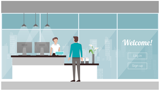
The days of shading, 3-D, and glossy surfaces to catch the eye are over. Today, many buttons and icons are flat and offer bright colors and open spaces so that users can navigate easily.
Getting lost in a mess of information, bored by the images and layouts, and generally alienated by difficult mobile experience is something that no web designer wants for visitors. All of this indicates that minimalism is the new wave for web design – something that talented marketing companies in Philadelphia can help you to achieve. Call us today at (215) 627- 4747 to talk about your site goals!
 Get In Touch
